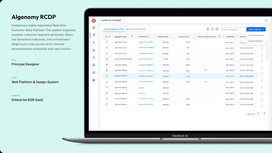
Audience segmentation, redesigned for marketers
Algonomy — Real-Time CDP, Phase 1
- The problem
- A 10-year-old CDP, built for data scientists, in a world of marketers
- My role
- Lead UX Designer · research, workshops, design, and usability tests
- Timeline
- 8+ weeks · 2 research, 6 design & testing
- Team
- UX, PM, 3 Engineers, 2 Architects, 2 SMEs
How it started
A quick overview of the project
Audience segmentation is the cornerstone of Algonomy's flagship Real-Time CDP — it's how customers build the marketing strategies that drive engagement and revenue. But the experience hadn't kept up with the platform around it.
I owned the design for the customer data platform business unit at Algonomy, working alongside product, engineering, sales, and marketing to take this part of the product from "good enough for ten years ago" to something that fits how marketing teams work today.
Quick primer
Wait — what is audience segmentation?
Audience segmentation is the process of dividing a broad target audience into smaller, more focused groups based on things like demographics (age, gender, income), location, lifestyle, or buying behaviour.
Marketers do this because a more relevant message converts better. The right offer in front of the right group at the right time drives higher engagement, more conversions, and stronger loyalty — which is exactly what a CDP exists to enable.
Why an overhaul
Three forces pushing us to redesign
- 01
The user had quietly changed
The platform was originally built for data scientists. Over the years the real user became the marketer — but the tool hadn't caught up.
- 02
Legacy workflows were getting in the way
A decade of features had stacked up on top of a workflow that was never simple to begin with — adding rules and attributes felt crowded and slow.
- 03
Customer expectations had moved on
Marketers now expect simple, intuitive tools. To stay competitive, the experience had to feel fresh and modern — not enterprise-from-2013.
My design process
From problem to high-fidelity in six steps
- 01
Requirement analysis
Aligning with PM, engineering, sales, and marketing on what success looks like.
- 02
Interviews
Talking to real marketers and stakeholders to understand the day-to-day reality.
- 03
Personas
Turning the research into a clear picture of who we were designing for.
- 04
Affinity mapping
Grouping pain points into themes, then turning them into problem statements.
- 05
Sketches
Low-fidelity paper sketches to explore navigation and information architecture.
- 06
High fidelity
Final designs in Figma, built on Algonomy's Harmony design system.
Research at a glance
How the discovery phase was set up
What we did in research
From interviews to data-backed problem statements
- 01
Interviews across age groups and tech comfort levels
Together with the team I prepared a script of 14 open-ended questions focused on values, motivations, and daily routines. The goal was to surface hidden pain points and workflow issues that don't show up in tickets.
- 02
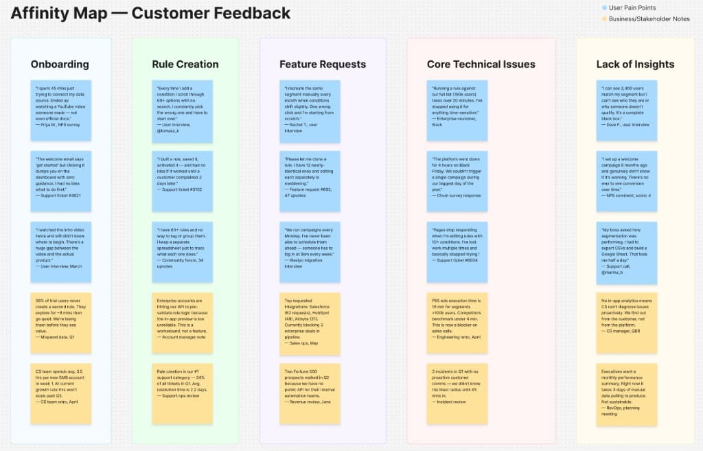
Affinity mapping with marketers and stakeholders
User insights and stakeholder interviews were grouped using affinity mapping. Streams included onboarding, rule creation, feature requests, and core technical issues — making it easier to prioritise.
- 03
"How might we" group design activities
The prioritised pain points were turned into redefined, data-backed problem statements. Group sessions then explored solutions before we converged on a common direction.
Meet the user
Emily Johnson — the marketer who just wanted to run a campaign
Emily is a marketer. She just wants to drive revenue, reduce churn, and deliver personalised content. She became the lens for every design decision — if a screen didn't make her life easier, it didn't ship.
Persona snapshot
- 01
Goal
Run targeted campaigns fast — without needing a data scientist to build the audience.
- 02
Frustration
The platform spoke a language she didn't. Even small changes required a ticket to the data team.
- 03
Workaround
She'd export CSVs, build segments in spreadsheets, and import them back — every single time.
- 04
What she needed
A visual, self-serve way to define audiences — no SQL, no jargon, no waiting.
Design and validation
From user flows to enterprise-grade final designs
- 01
User flows as the bridge
The charrette outputs — basic user flows agreed upon in the workshop — went directly to primary stakeholders for review. Feedback was collected before any visual design started, which meant we never built the wrong thing at high fidelity.
- 02
Low-fi sketches to sharpen the details
Once flows were signed off, I moved to paper sketches to explore UI patterns and choose the most efficient path through each task — anchoring every screen decision back to the original problem statements.
- 03
High fidelity in Figma, on Algonomy's Harmony design system
Final designs followed Algonomy's internal Harmony design system — enterprise-grade components and colours that kept the new experience consistent with the rest of the product.
- 04
Designed for web and iPad
Viewports were chosen to work across iPad, laptops, and large external monitors — meeting marketers wherever they actually work.
Final designs
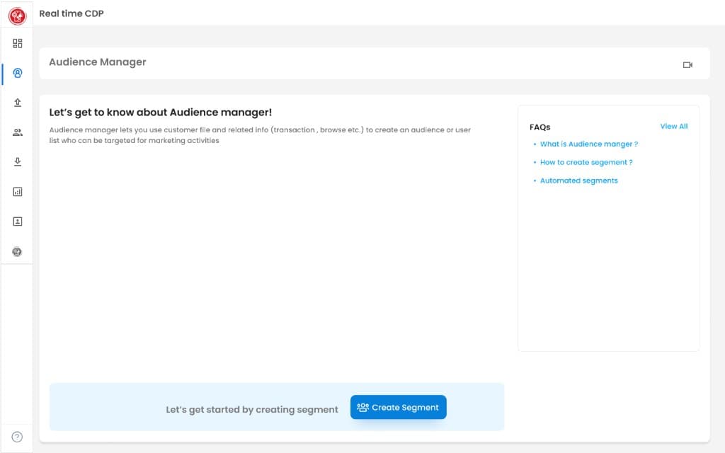
Landing page — empty state with contextual FAQs to orient first-time users.
Before and after
A 10-year-old CDP, refreshed and in the field
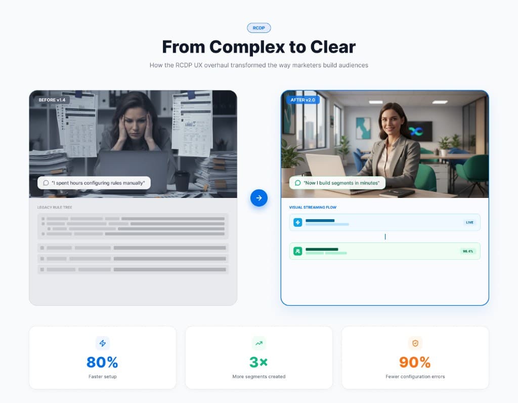
The old experience: a 10-year-old CDP built around the data scientist persona, with a heavy feature set that worked but didn't feel inviting to a marketer.
The new experience: a refreshed CDP with new capabilities and a far more approachable visual language. It's now in early field trials, open to customers to triage and adapt.
“Our marketeers have become 4x faster due to the overhaul.”
