
Redesigning the experience for a remote sales workforce
Squadstack — SquadIQ mobile app overhaul
- The problem
- Scaling a remote, crowdsourced sales workforce
- My role
- Senior Product Designer · research + onboarding & screening
- Timeline
- 6 phases · 5 months
- Team
- Product, Design, Supply & Ops
How it started
My first project at Squadstack
SquadIQ is Squadstack's mobile sales app — it helps brands reach and convert customers through a crowdsourced workforce of remote experts: homemakers, part-timers, freshers, and students. The product had outgrown the system supporting that workforce, and scaling was getting harder. The overhaul had one job: build a clear way to screen, grow, and keep that talent.
I owned the user research end-to-end and led design through the onboarding and screening journeys, working alongside product, design, and supply & ops.
The plan
Six phases across two quarters
- 01
Research and discovery
Understanding the remote workforce and the existing system.
- 02
Ideate and assemble
Co-sketching the future model with every team in the room.
- 03
Review
Pressure-testing direction with senior stakeholders.
- 04
Stitch
Joining the pieces into one coherent experience.
- 05
Test and partial deploy
Releasing parts of the new flow to real users.
- 06
Full steam deployment
Rolling out the complete experience to the workforce.
Research at a glance
How the research was set up
Beyond the numbers
What the research actually involved
- 01
Interviews with sales experts
Each session had a panel of interviewers, note takers, and observers — focused on real pain points and which ones mattered most.
- 02
Competitive analysis across 6–7 products
We audited six to seven competing CDPs and segmentation tools — Segment, Salesforce CDP, Adobe Experience Platform, and others — mapping how each handled audience creation, rule logic, and marketer onboarding. This gave us a clear benchmark for what "good" looked like and where the category had room to move.
- 03
Mapping how the system worked today
Sessions with operations and data science teams helped us chart the current user journey — where it stalled, where manual work piled up, and where the gaps between what the platform could do and what marketers could actually do were hiding.
Research and synthesis
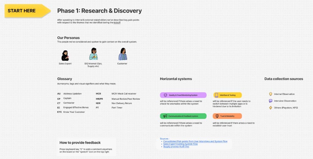
Design and validation
Wireframes first, then a coherent visual language
- 01
Medium-fidelity wireframes in Figma
Designed to be reviewed by stakeholders, supply teams, and expert users — and to give engineering a head start on building components.
- 02
Validated by senior management and expert users
Catching gaps and edge cases before we moved into high fidelity.
- 03
A professional, corporate visual language
We moved away from a playful look toward something that felt trustworthy. The system was built on Material Design, since the app shipped on Android.
- 04
Component-based, ready for the web
The UI framework was structured to support progressive web apps as the product expanded beyond mobile.
Design charrettes & final screens
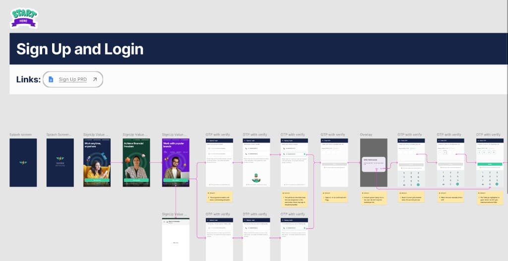
Sign-up & login flow — splash screen, value props, OTP verification.
What I learned
A first project that turned into a crash course
This was a new company, a new team, and a new set of tools — all of it learned through remote collaboration. I wore multiple hats: user researcher, designer, charrette moderator, and presenter, often in the same week.
The biggest takeaway was understanding the nature of a distributed workforce, and how to design for a system where the people using your product are also the supply you are trying to scale.
“[Placeholder quote — paste a real one from Squadstack leadership or a pilot expert when you have it.]”
Next case study
BigSky 2.0
Boeing — Aircraft Planning Tool Redesign